
swëdn Confidential. Brand & legal review

Brand review

A fresh Scandinavian pouch experience.

Swëdn is a proposed adult nicotine retail brand, presented here for legal and trademark review.

Concept Swëdn Market Florida, United States Category Adult nicotine retail
This page is for internal legal review only. It is not intended as consumer advertising, a point of sale, or a public brand launch.
01 Brand overview

A Swedish-inspired, adult-only nicotine retail identity.

Swëdn is a proposed retail and e-commerce brand for adult nicotine products, centred on Swedish-style nicotine pouches and related age-restricted products.

The brand is intended for use in 21+ retail environments, online age-gated experiences, and regulated sales channels. Every touchpoint is designed to read as a mature, premium retail category, not a novelty or lifestyle product.

The identity leans confidently into its Swedish inspiration: a friendly rounded wordmark with an umlaut wink, set in a bold blue, yellow, and white palette. The tone is warm, clean, and unambiguously adult.

This document sets out the proposed identity so counsel can assess trademark, branding, geographic-origin, and nicotine-marketing compliance before any use.

Primary market
Florida / United States
Working name
Swëdn (pronounced "Sweden")
Product category
Adult nicotine retail (pouches & related)
Brand tone
Warm, clean, playful, Swedish, adult
02 Primary wordmark

The swëdn wordmark is the primary mark.

The primary brand identity is the swëdn wordmark: a rounded lowercase logotype with two yellow umlaut dots over the "e". It is the main mark used on storefronts, packaging, delivery materials, the website header, receipts, and all formal brand applications.

swëdn primary wordmark, blue with yellow umlaut dots
Primary wordmark, supplied artwork, blue with yellow umlaut
swëdn on white
Full colourOn white
swëdn on blue
On blueWhite + yellow umlaut
swëdn on yellow
On yellowBlue + white umlaut
clear spaceclear space
swëdn clear space
Clear spaceMin. = x-height
swëdn small sizes
Small sizeLegibility floor
swëdn in black
Black & whiteFax / print
03 Colour system

Blue, yellow, and white: used with conviction.

The palette is the brand. Swëdn blue carries the identity, yellow provides the wink, and white keeps every environment feeling clean, bright, and retail-grade. No secondary colours are introduced.

Swëdn Blue#075EDB. Primary: signage, packaging, uniform, interiors
Umlaut Yellow#FDD435. Accent: details, highlights, the wink
Snow White#FFFFFF. Space: walls, cartons, breathing room

Working ratio: blue leads, white carries space, and yellow stays a deliberate accent so it never tips into novelty.

Fresh, clean, and unmistakably Swedish. A pouch experience built for adults, delivered with a wink.

Swëdn brand idea

04 Packaging & delivery

Nicotine pouches. Delivered your way.

The e-commerce packaging system carries the identity edge to edge: a blue mailer carton, a white carton, and a yellow poly mailer, each led by the wordmark with a small Swedish-flag detail on the side.

Swëdn delivery packaging: a large blue mailer box, a white carton, and a yellow poly mailer, each printed with the swëdn wordmark and the line 'Nicotine pouches. Delivered your way.'
Blue mailer

Hero carton for subscription and multi-tin orders.

Yellow mailer

Lightweight poly mailer for single-tin deliveries.

Flag detail

Small Swedish flag on the side panel, subject to legal review.

05 Retail bags

The palette walks out of the store.

In-store carrier bags rotate through all three brand colours, with contrasting rope handles and the wordmark front and centre. The bags double as the brand's most visible out-of-store presence.

Three Swëdn paper carrier bags in blue, yellow, and white, each with the swëdn wordmark and a small Swedish flag near the base.
Three colourways

Blue, yellow, and white in one system, no sub-brands.

Contrast handles

Yellow rope on blue, blue rope on yellow and white.

Adult presentation

Clean and premium; no imagery aimed at minors.

06 Store interior

A bright, pharmacy-clean retail floor.

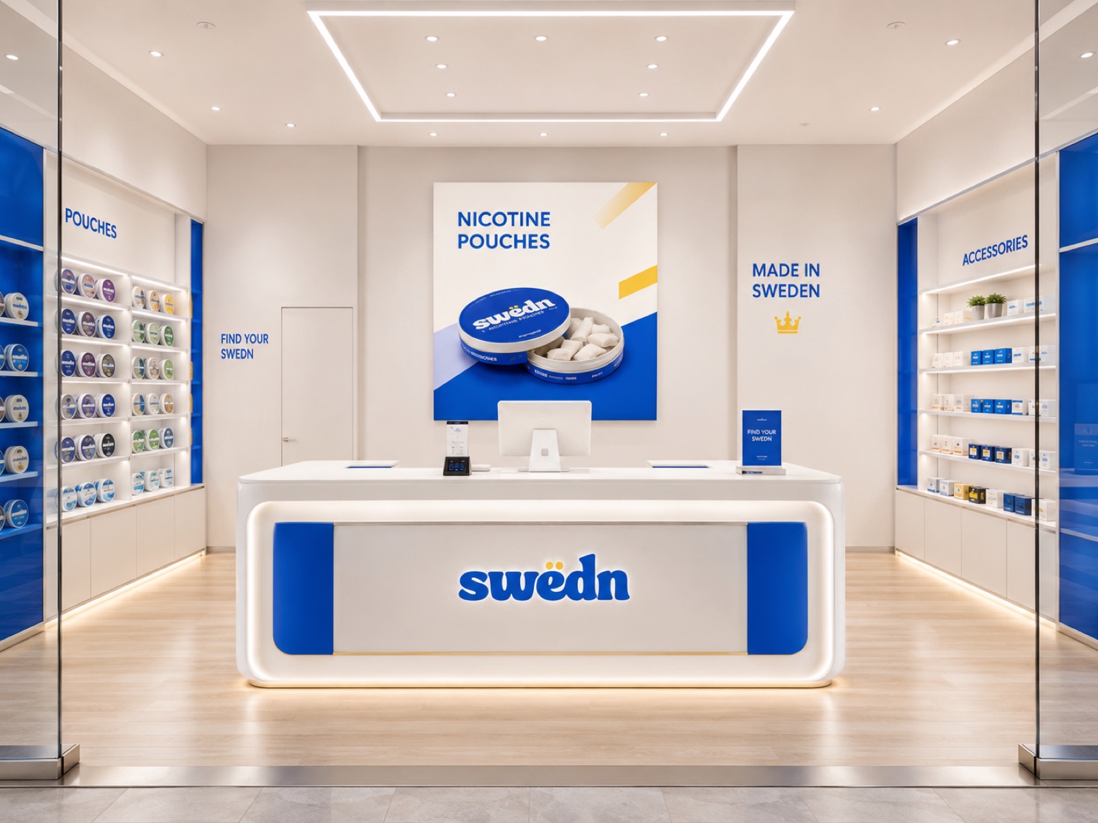
The interior concept is white-led with blue display bays. Product sits in controlled, backlit displays; the illuminated counter carries the wordmark and the welcome message.

Swëdn store interior: a white illuminated counter with the swëdn wordmark, blue display bays of nicotine pouch tins on both walls, and wall signage in brand blue.
Controlled display

Tins behind glass in fixed bays, not open shelving.

Wayfinding

"Pouches" and "Accessories" zones in brand blue.

Concept note

The "Made in Sweden" statement and crown shown in this mockup will not be used.

07 Storefront

Wordmark-led, mall-grade, age-controlled.

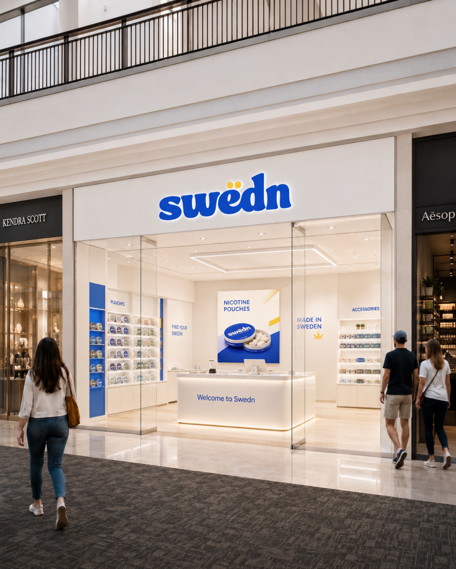
The storefront uses the blue wordmark on a clean white fascia. All product sits inside the unit in controlled displays; age verification happens at the counter, consistent with 21+ retail.

Swëdn mall storefront: illuminated blue swëdn sign on a white fascia above a glass front, with blue display bays and an illuminated white counter inside.

The unit reads as a premium specialty retailer alongside mainstream mall tenants. The identity does the work. No product imagery faces the concourse.

  • Illuminated wordmark as the only fascia sign
  • Glass front; product visible only in controlled bays
  • 21+ age verification at the counter
  • Category signage inside, not on the concourse face
  • No promotional pricing visible from the mall

Box, bag, counter, and uniform: every touchpoint carries one identity, one palette, and one standard of adult retail.

Retail principle

08 Staff uniform

The brand, worn by trained adult staff.

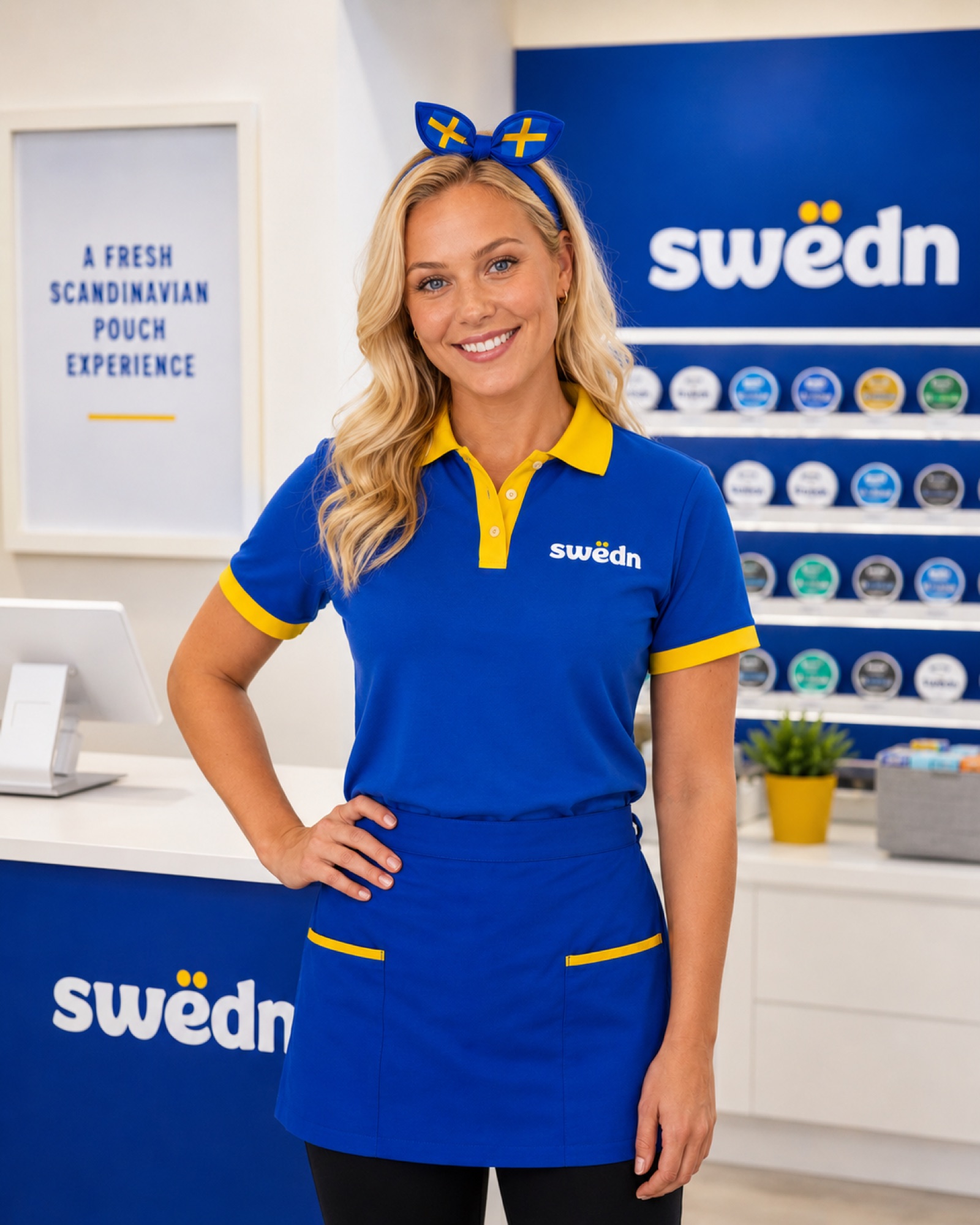
The uniform is a blue polo with yellow trim, a blue half-apron with yellow pocket detailing, and an optional flag-print headband. It is professional workwear in the brand palette, worn by adult staff, not a costume or character.

Swëdn staff uniform: an adult staff member in a blue polo with yellow collar and cuffs, a blue apron with yellow-trimmed pockets, and a Swedish-flag-print headband, in front of the pouch display wall.
Second view of the Swëdn staff uniform showing the wordmark on the polo chest and apron, with the store counter and display wall behind.
  • Blue polo with yellow collar and cuff trim
  • Half-apron with yellow pocket piping
  • Optional flag-print headband, worn by adults
  • Wordmark embroidered on chest and apron
  • Professional and understated, not a novelty costume
  • Signals trained, consultative 21+ service
09 Adult-only brand positioning

Compliance intent.

Swëdn is intended to be marketed only to adults aged 21+. All online experiences should include age-gating where required, and every channel should present the brand as a mature, adult retail category.

  • 21+ positioning
  • Age-gated e-commerce
  • Adult-facing messaging
  • No health claims
  • No "safe alternative" claims
  • No "Made in Sweden" or other origin claims
  • Swedish flag details subject to legal sign-off
  • Clear nicotine warnings where required
swëdn wordmark

The swëdn wordmark is the primary brand. The palette leads every touchpoint, and all channels are strictly adult-facing, 21+ retail.

Prepared for legal review, not for public launch